Skip to content
All work
Meer HQ2025 · Live

Meer HQ

Brand identity, digital marketing studio

A brand identity, the document that holds it together, and the website design it had to survive. For a studio that sells social media, marketing, web and funnels as one service.

  • Logo system
  • Colour
  • Typography
  • Brand guidelines
  • Website UI design
Visit the live site
Fig. 1 — Meer HQ, working view
Client
Meer HQ
Sector
Digital marketing studio
Deliverable
Brand identity and guidelines
Our role
Brand identity and website UI design
Build
Not ours — the site was built from our designs

The problem

Meer HQ had an offer that only makes sense as a whole: social media, marketing, web and funnels run in one flow rather than bought piece by piece. An identity that only worked as a logo would have undercut that, because the brand has to survive being applied by other people, on a billboard one week and a business card the next. So the work was not a mark. It was a system precise enough that the next person to touch it cannot get it wrong, and then eleven page designs built on top of it — handed to developers we were not sitting next to, which is the only honest test of whether the rules were written down well enough.

What it does

Logo system
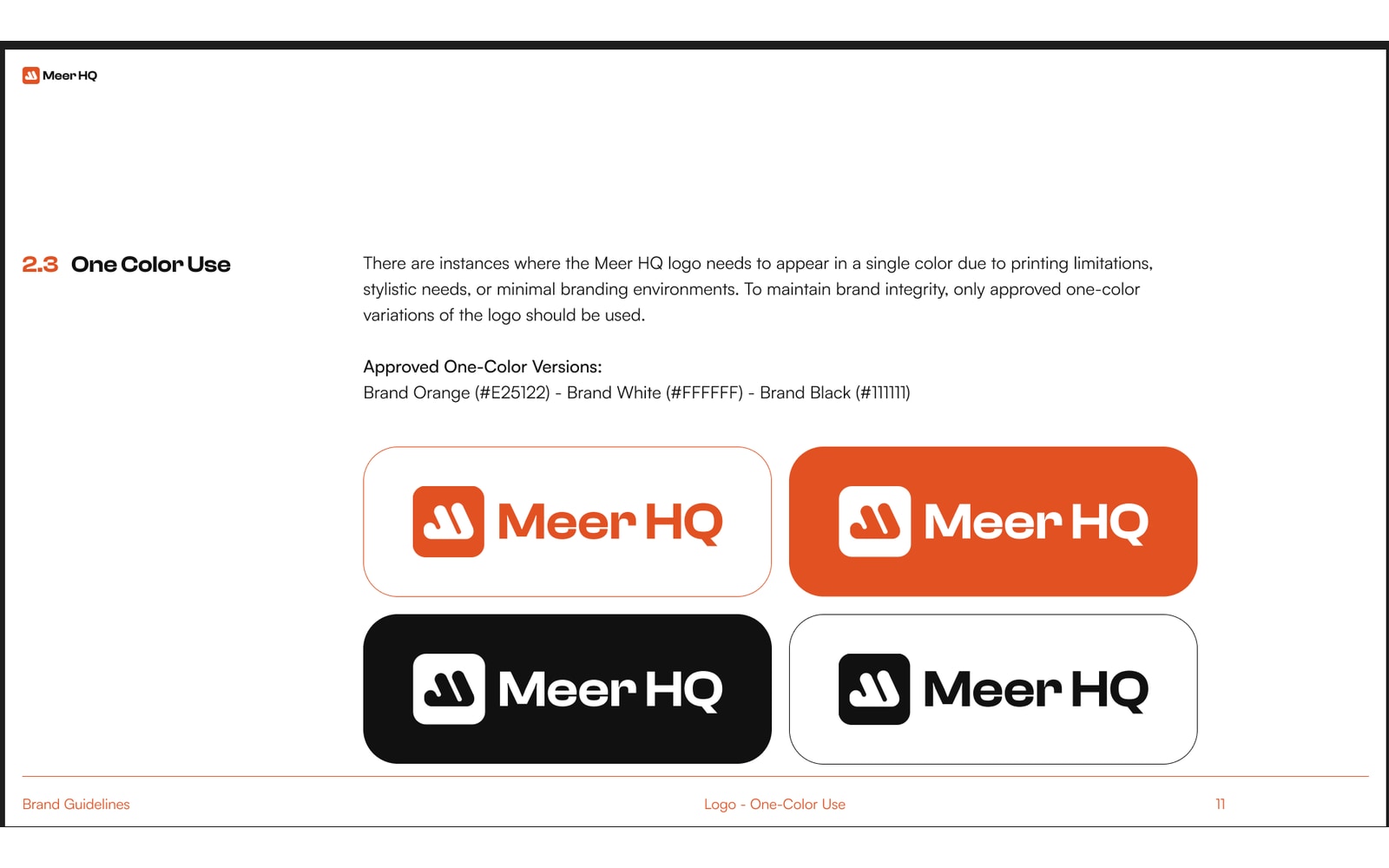
A primary lockup, a standalone icon, and the approved one-colour versions in orange, white and black, each with the grounds it is allowed to sit on.
Rules for getting it wrong
A misuse page covering stretching, recolouring, and the backgrounds that kill legibility, so the mark holds up once it leaves our hands.
Colour
Brand Orange #E25122 with black and white as the primary set, plus five secondary tones for when a single orange cannot carry a whole layout.
Typography
Clash Display across four weights for anything that has to be loud, Satoshi for everything that has to be read, and the alignment rules that keep the two apart.
Brand in action
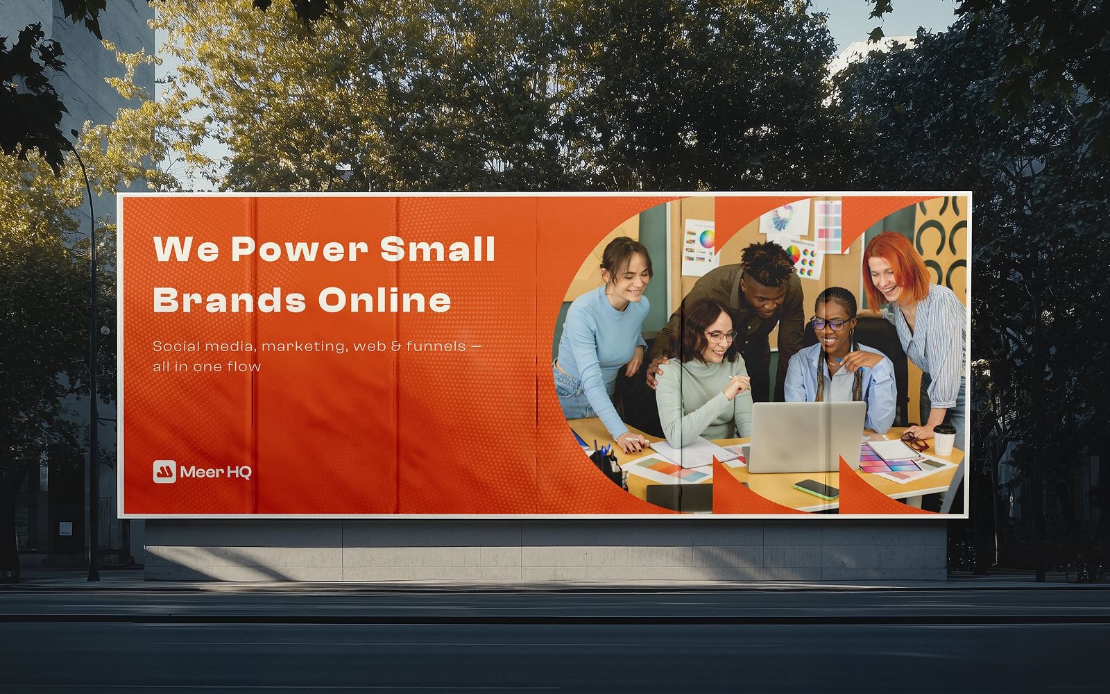
The identity applied to a business card, a billboard, tote bags, notebooks and printed paper wrap — so the guide shows the brand working, not just the rules.
Eleven page designs
Home, about, services, work index, two selected-work layouts, careers, contact and the blog, each designed at desktop and mobile width before anyone wrote a line of markup.
Handed over to build
The website was designed here and built elsewhere, which is the real test of a system: it had to be unambiguous enough to hand to developers we were not sitting next to.
The guide itself
Thirty-two pages covering mission, vision, values, logo, colour, type and application, as one document the client owns.

Screens

Meer HQ screen 1
Meer HQ screen 2
Next
Sewasimilara
Custom bridal and prom, Nigeria